Monday, 19 March 2012

Timothy Allen Case Study


Timothey Allen is a well known and renound photographer who is known mostly for his amazing time lapse videos that he created when touring the world with the BBC’s Human Plant Crew.

T. Allen was born in Tonbridge in the South East of England in 1971.  At age 22, after graduating from Leeds University with a BSc Zoology he left the UK and spent 3 years traveling around Indonesia which was the catalyst that sparked his passion for photography.

In the early 1990’s, after beginning a part-time diploma in photography, Timothy joined an aid convoy to Bosnia in order to shoot his first year reportage project.  Six months later he had dropped out of college and moved to London to begin work for the Sunday Telegraph. This new founeded career that he under took later inspired commissions from all the British broadsheet publications, more commonly known as the BBC. His final stage of his career upto date is a 6 year position at The Independent working predominantly on features and portraits.  Timothy joined Axiom Photographic Agency in 2002 leading him to cover a dynamic and broad spectrum of global stories with subjects ranging from the civil war in the remote Spice Islands of far eastern Indonesia, to the intriguing subculture of The World Taxidermy Championships in Springfield , Illinois.

In recent years, the focus of his work has turned to our planet’s remaining indigenous societies and he currently devotes his time to documenting the diversity of humanity’s cultural heritage. His multi award winning documentaries have taken him to every corner of the globe, from 19 000 ft up in the Himalayas to 40 metres beneath the South China Sea as well as projects within communities in the Arctic, tropical rainforest and remote desert locations.

The image in the below is an images that Allen has captured in Indonesia. 


One of his most famous pieces of work can be view from the URL link


The link plays a video that shows the 4 year time lapse that he created using both a locational landscape and a studio. To create this timescape he created a specially designed rig and studio area for this. For the studio part of the project he had to paint everything blue and place flowers in areas of the locational site that were plain, he did this by blowing a picture up and projecting it onto a wall.

The studio that required the most viewing was the camera itself as if the set or the camera moved more than 2mm the hole lot of the project up to any point would be ruined and him and his team would have to start all over again.

My personal opinion on this video is that it is the most inspirational time lapse video that I have ever watch. This is due to the way him and his team had had o spend a year researching and developing idea’s just in able to make sure that the project that want and are under taking can be a success. I also find the time lapse inspirational due to the way the team had to make there own rigs and devices in able for there project to be a success. Further more looking into this video I am now going to take inspiration and develop my own rig for my Final major projects theme of Time Lapses and Time Scapes.

William Eggleston Case Study


William Eggleston is an America photographer who is widely known and credited for taking pictures of urban or decaying scenes that most people would find uninteresting and horrible to look at. However through out the years he has had them printed and placed in a gallery for an exhibition.

Most of the work he produces is things that are either left to decay or have a strange urban sense to them, For example the image below is of a kids trike that has been dumped and left on the street. The image overall from my point of view has a sense of decay as there is no one around the bike and the bike looks to be in poor condition giving a sense that it has not been very well looked after.


The purpose of his work is to show ordinary life but in an unusual way. His work has been seen in many galleries and portfolios through the world. A list of his publications can be seen below.

·      The earliest commercial use of Eggleston’s artwork was in the album covers for Memphis group Big Star, who was an American rock band. 

·      In 1974, 14 dye transfer pictures that he printed were published by Julian Hohnenburg and distributed by Harry H Lunn Jnr in Washington DC.

·      Seven Chromogenic coupler prints were published by Caldecot Chubb in New York, during 1979.

·      Troubled waters, Fifteen of these images were published by Caldecot Chubb

Eggleston has quote many things about his work like what he finds makes the image and what he found inspiration for taking images. However the quote that stands out for me the most is the following

The Observer News paper developed a piece of work on Eggleston showing the pieces of work that he has done. A quote from the piece that stood out for me is the following :-

“It would be difficult to imagine the world according to David Lynch, Gus Van Scant, Juergen Teller or sofia coppala without the world”.

My opinion on his work is that it is interesting to look at and develop ideas from. This is due to the way he has captured his images, his images are to show life but in an unusual way, and as you can see from looking at his push bike image he does this well as, he shows a normal scene around what can be seen in the background as an everyday human life.


Wednesday, 15 February 2012

Richard Billingham


Richard Billingham is an English photographer and artist who is known for creating a photobook which documents his parents life. The images in which he took were later published into a book called Rays a Laugh. The Book documented and portrayed the poverty and deprivation in which he grew up in.

To document his parents life using photographs, he did it over a period of six years. When capturing the images he couldn’t use a modern camera that was coming out at the time as his family was great for money, so the photographs he captured of his parents were taken with the cheapest film camera, which was a instamatic camera with a built in flash, he could find. This film that he used provided harsh colours and shadows and bad focusing.

In my opinion this added to the effect of his images as it doesn’t make them look all flash and set up, it made the images and the content of the images look as if they were just taken at random when something was going on with either his mother or his father.

Most of his images featuring his father were more or less the most interesting as his dad was an alcoholic and was most of the time hung over, meaning that he didn’t always get what was going on and the emotions of his father would be good to capture.

When Billingham was taking these images he thought himself as a painter and not a photographer, and the images he would take would be source material for his paintings that he would produce. Whilst shooting his parents and creating these images he never took great care of his equipment. His original intentions of these images were to study the human figure in a interior space.

Over the years of taking these images his parents grew to the fact that he could be snapping at anytime.

Over the years since his book publication he has had the images of his parents shown and displayed in galleries around the country. One of which being the Royal Academy of Arts in London during 1997.

Monday, 30 January 2012

Henri Cartier-Bresson


Henri Cartier-Bresson

Henri Carter-Bresson to give him his full title is a French photographer who was born in 1908 and passed away in 2004. He was considered to be one of the best or not the best photojournalism photographer the world has ever seen. His concept of photography for capturing great images was what he called “The Decisive Moment”. The Decisive Moment was tended to give the impression that Cartier-Bresson believed that story-telling, the catching on film of the historic moment, was the essence of good photography.

Bresson also stated that the Decisive moment is the decisive moment, “it is the simultaneous recognition, in a fraction of a second, of the significance of an event as well as the precise organization of forms which gives that event its proper expression”. For capturing his images he used a 35mm Film camera made and developed by the company Leica. He used this camera as it was, small lightweight and easy to use. The company Leica was founded in 1913, in Germany by Alfred Schopf who was at the time the CEO of the company. The development of the technology is in my opinion what allowed him to make this decisive moment using his 35mm film camera.

He described his camera when capturing images an extension on his eye. He often said that the creative part of photography is very short, “A painter can elaborate a writer can, but as its given, we have to pick that moment the decisive moment. “ (Bresson).

Whilst he was out shooting and finding the decisive moment he only ever shot his images in black and white and never changed over to colour when the time came around. He also never used a flash to fill areas he always wanted an image to look as pure as what he could see it through the viewfinder of his Leica, He also only ever used one lens which was a fixed focal length 50mm lens.

After the images were taken and it came to the time were the images were to be developed he never found that his images wanted cropping, he always kept them the same as when they were taken. He saw his camera as a tool and a way of drawing or painting an image just like when you use a brush to create a painter.

In 1939 Bresson was unlucky as he was one of many that was in the war as a corporal but he worked for a special unit, which was the film and photo unit. After joining the war he was captured as a prisoner of war for 3 years, however he did eventually mange to escape in 1943 were he then fled to the French capital, Paris were he worked with the French resistance. He worked with the photographic unit in particular and he recorded the Nazi’s occupation and the liberation.

After the war was over and many years later, Bresson was persuaded to join Magnum photos.

Peter Conrad who worked for the Observer in 2004 wrote about Henri Bresson and stated the following about him, “A great, pioneering photographer his pictures which captured not just Paris but the globe, not just everyday life but world- changing events, are emblems of 20th Century extensive”.

He had his first ever exhibition in Madrid, Spain, in 1933. Later in that year he also had another show in the place were many people wish to have a exhibition this place is of course New York City in America.

My personal response to his images are mixed as some of his images I found quite remarkable and a thrill to look at were as some of them I find aren’t very good. The image below is one that Bresson has captured of a couple sat on a Hill over looking a river as a boat passes by on it. I find this image uninspirational as to me in my opinion it looks like a typical holiday snap. Were as the image furthest to the bottom is an image that I find is a true image and one that people will enjoy to look at just as much as I do. In the image You can see a set of stairs that run down to a low level street were a passing cyclist can be seen passing in the distance.

When looking deep into the image you can see that the cyclist is slightly blurred and a little out of focus. I find that this technic has worked well in the image as it gives a sense of movement. The way the image is a little dark at one side also works well as it leads your eye down the stairs and to the cyclist that is passing by.


The two lines below are links to some resources that I have found of Bresson, and what people have said about him.


http://www.guardian.co.uk/news/2004/aug/05/guardianobituaries.artsobituaries

Thursday, 26 January 2012

Colin Grey

Colin Grey


In my opinion, I find his work very mined blowing and depressing as you go through his work. The purpose of his work is to show and document his father’s and his mother’s life when very ill and coming to the end of there lives. When it comes to media, technique and materials that he has used to create his pieces of work, it is more or less noticeable straight away what he has used to capture his images as all of his images or well most of them are in a square format, this would suggest he has used a medium format camera to capture the images.

Colin Grey has on numerous occasions spoke out about his work, when viewing his work in the ferens art gallery he stated on a plack “I felt comfortable with the camera square format, perhaps working back to my dads box brownie twin, I now felt that work with my parents was becoming a serious project”.

When viewing his work you get very mixed emotions as from my point of view it was very depressing and mind blowing to look at but to others it was different as some people say it a fabulous collection of images, some say that the set of images is a lot like my comment as it comes across as upsetting and depressing to view in an order.

He hasn’t just created the images that are found in the galleries and art exhibitions, his work can be found over a various number of places ranging from magazines. He also has made different types or genres of photography like Constructive, Narrative and Documentary.

When grey produced his work he had many inspirations but the main ones were the people he photographed in his documentary pieces. The main people being his parents.

The image that I have chosen from his documentary collection to analysis is The Grass is Greener 1989. My thought and opinions on the image when studying it vary due to the way the image has been captured and the way it has been put together.
The subject contained with in the image is an old women leant against a wall with plain white wall paper but with a normal flower pattern contained within it. She is also not, in my opinion, the main subject as in the foreground can be found a rather unique yellow piece of pottery. With the piece been so bright and made to stand out in the image it over powers the lady or women in the background of the image.

The mood for the image is rather plain and moody due to the way the pot in the foreground is made to stand out and the women in the background facing the wall is there to show or suggest how things can be over looked and be placed in the past without and thought of what is going on.

My reaction when viewing the image is a sad and depressing as when you look at the image you get a feel for what it most be like to be alone with no one to look after you.

As a conclusion for looking at his work you get a sense that when his parents were around they were not very well and he wanted to show this through his images. As in most of his collection he didn’t take images of them looking happy like happy snaps, he took images of them when they were struggling or feeling ill.

Monday, 16 January 2012

Thomas Hopker


Thomas Hoepker


The images above are the image that Thomas Hoepker captured of 9/11 the main image that cause all of this constroversy was the thid image down. 

In the Image That Thomas Hoepker captured back in 2001, are a group of New Yorkers sat gracefully chatting in the sun in Brooklyn behind them in the background across the brilliant blue water, can be seen a massive and terrible black smoke rising from the lower Manhattan. This particular place is where the two towers were struck by a hijacked airline that very morning.

Ten years on after the event had took place, the image that Hoepker captured is still seen as the most iconic image of 9/11 even though the history behind the event is still seen strange and torturous.

Hoepker took the image just as the strike of the plain hit the building. Even taking this into consideration, he did not however publish the image he captured of the event until the five year anniversary occurred. Were as most press photographers had there image published the same day it happen so it could be broadcasted to the world showing everyone what was going on.

When the image was finally published it caused a massive and instant controversy. Frank Rich a critic wrote in the New York Times about the image and what his point of view was on the image. He stated “The image undeniably troubling picture an allegory of American’s failure”.

Rich’s view an opinion on the image was instantly disputed. Walter Siper, identified himself as the guy in glass or shades in the right of the image.

He stated that they were not sunbathing and having a relaxing time at the waterside, he was in fact in a state of shock and disbelief. He also complained the image he was in was not taking with there consent and permission when Hoepker capture them.

Hoepker rebelled at what had been said and stated that you can’t photograph feeling. Even when the image was published and people spoke about his misdoing for not ask permission to photograph them, it is still seen as the most iconic and defining image of that tragic day.

It has also since that day that photographers, amateurs or professionals, get stopped in the street and asked what they are doing as it is seen upon that a person might take an image that can once again be seen as the defining moment for an event but for some it can be seen as politically upsetting.

Monday, 9 January 2012

Documentry Photographers Historical and Contempary


Historical Photographer - Thomas Hopeker


Thomas Hopeker USA, Muhammad ALI, formerly Cassius CLAY, boxing world heavy weight champion in Chicago, jumping from a bridge over the Chicago River. 1966.


USA. Brooklyn, New York. September 11, 2001. Young people relax during their lunch break along the East River while a huge plume of smoke rises from Lower Manhattan after the attack on the World Trade Center.


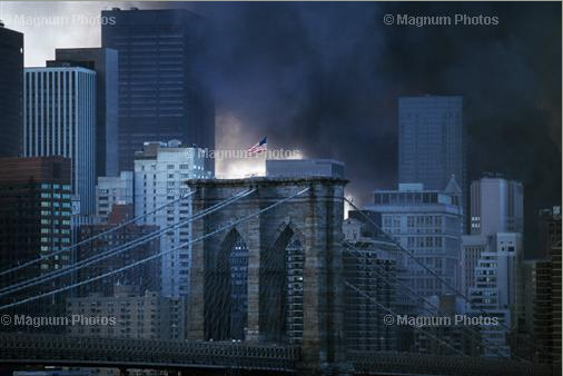
New York, NY, view from Manhattan bridge towards Brroklyn Bridge and downtown Manhattan during aftermath of World Trade Center attacks on September 11, 2001

Contemporary Photographer - Elliot Erwitt


Monday, 12 December 2011

Don McCullin


Don McCullin


In one of Don McCullins books, entitled open skies, his Images are described as being serious and shocking by the poet and essayist John Fowles. He stated in the book

The first time when don showed me the photographs for the book, their seriousness came as something of a shock, not ;east because I had failed to take proper  account of a prior confession he had made. The many wars he had covered, I believe a dozen in twenty years, had , he said damaged his soul, and the scars of that battering were now emerging in these new lanscapes”.

Just by looking at his work you can see that his documentary war images have rubbed off on the rest of his other images like his portraits and landscapes as in his war images he captures the dark moods when people have just killed or are prepared to kill. Some other moods he shows in his images are when people are really run down and look really ruff.

With the dark mood of his war images he features the same mood in his landscapes as they are dark and techniquelly under exposed but for what he has seen these images fit the mood he has seen in the past.

Also According to Jon, Don has talked but it rarely of what he thinks his pictures mean, unlike many photographers these days who, not satisfied with simply printing their work. With Don not talking about his work it doesn’t surprise me as what he must have seen, when documenting the wars he was at, will have been torturing for him to see.

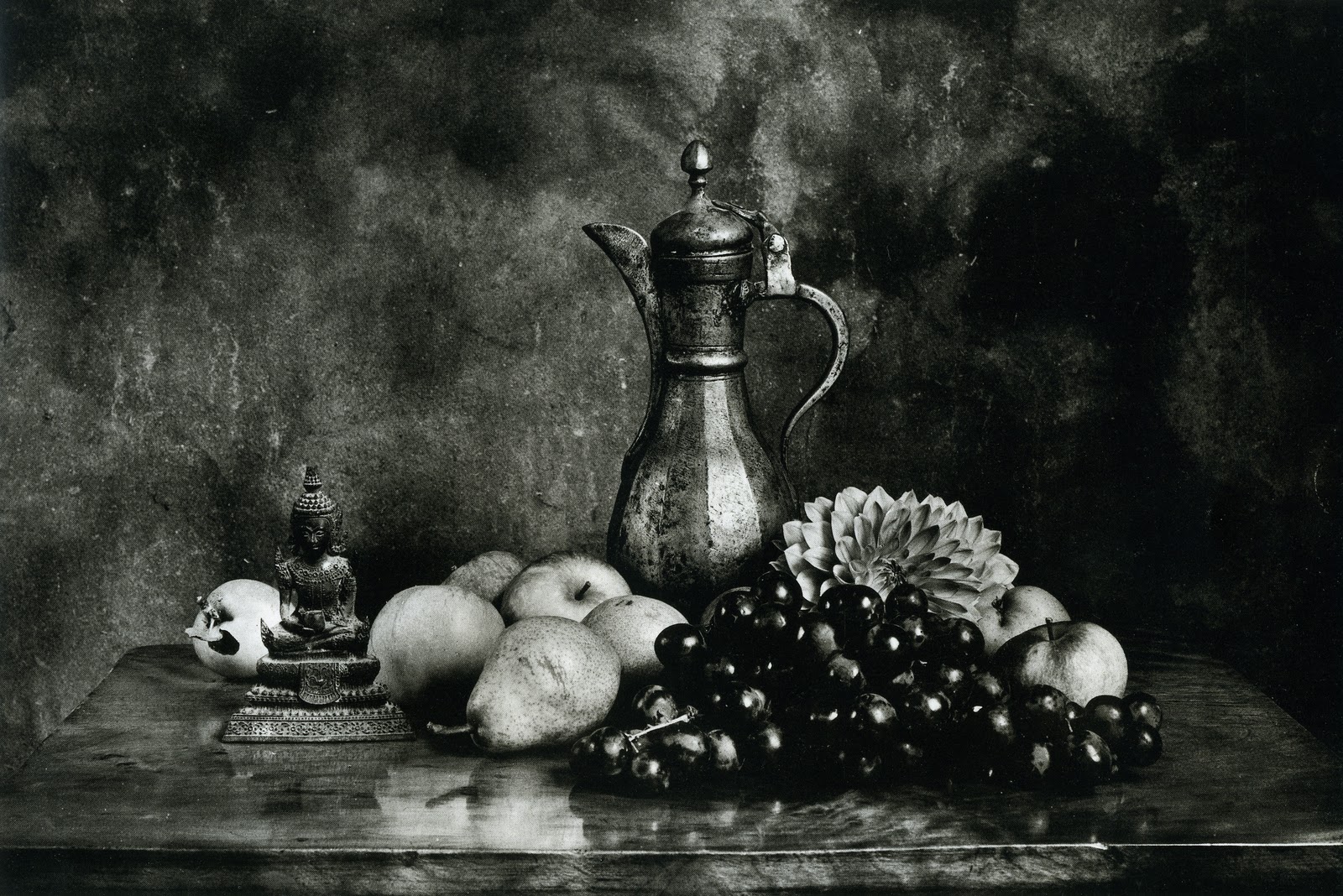
His still life images also have the same mood and effect when viewing them as they are dark and simple with basic lighting, some of his images have been captured using natural lighting but the way he has captured them is the part that makes the images look moody and dark.

For example the image of the flowers on a side table with some fruit and horse has a really dried out tone, an example of this would be the flowers dropping down to almost simples death. All his still life images and even his location images like the landscapes and war images are captured in monochrome as the, black and white makes an image more serious and moody.

Some of his work can be seen below

 
The image above is an a image that don captured of some still life objects. In the image its features some flowers that have the look as if they are dying, this mood on the flowers in my opinion relates to his time taking images of different wars, as the flowers relate to death and in some cases this is what don would have seen when he was taking images during the wars he attaended.


The image above is, in my opinion, is one of Don McCullins best images as it has create geometric shapes and has great textures for the background just like the backgrounds to all his Still Life. The image also features Great objects such as the fruit and the water cup. The image again has quite a dark appearance to it like the rest of his images.


The Final Image above is an image that has real meaning and has some great texture to it. The meaning for the image from my point of view would be the flowers are leant over to show how they are strong but are dying out, the flowers also lead into the horse at the corner of the table. The fruit in the image in my opinion is there to make the image look a little more homely. The table on which the objects are placed on makes the images texture as it gives great shadows and an understanding of where the light will have been when Don captured the image.

As a hole I find Don McCullins Images an enjoy to look at and view but also an massive inspiration to my own work, as upto now all my images have been well lite and have had quite a lot of light and high keyness to them, were as in these images they are quite dark and moody which in some cases makes the image stand out more and makes the image look more impressive.
 

Monday, 5 December 2011

Task 1 David Bailey


David Bailey was born on the 2nd January,1938 and is a celebrated and famous photographer.


Born in London, England, he taught himself photography, before serving with the Royal Air Force in Malaysia in 1957. In 1959 he became a photographic assistant at the John French studio before being contracted as a fashion photographer for Vogue magazine. He also did a large amount of freelance work.

Along with Terence Donovan, he captured, and in many ways helped create the Swinging London of the 1960s: a culture of high fashion and celebrity chic. Both photographers socialised with actors, musicians and royalty, and found themselves elevated to celebrity status. Together, they were the first real celebrity photographers.

The Swinging London scene was aptly reflected in his Box of Pin-Ups (1964): a box of poster-prints of 1960s celebrities and socialites including Terence Stamp, The Beatles, and notorious East End gangsters The Kray Twins. The box was an unusal and unique commercial release, and it reflected the changing status of the photographer that one could sell a collection of prints in this way. (The strong objection to the presence of the Krays on the part of Lord Snowdon was the major reason no American edition of the "Box" ever appeared, nor a British second edition issued.)

In 1966, the movie Blowup was made. The film concerned itself with the work (and sexual perks) of a London fashion photographer who was largely based on Bailey.

As well as fashion photography, Bailey has been responsible for record album sleeve art, for performers including The Rolling Stones and Marianne Faithfull. He has also directed several television commercials and documentaries.

Bailey has married four times: in 1960 to Rosemary Bramble, in 1967 to the actress Catherine Deneuve (divorced 1972), in 1975 to the model Marie Helvin and in 1986 to the actress Catherine Dyer to whom he is married as of 2004. He was awarded the CBE in 2001.


He is an inspiration to me as he has shot many products in Fashion and Portraiture. However he mainly shoots things that are around the genre of Fashion.

Bailey also took shots for the famous fashion magazine Vogue. When he set up and even took an image for the front cover of the magazine he had a particular style in which he took the shot as the final images for the cover were always of the model and close up not showing the hole body. They would show anything above the hip to the top of the head. An example of which can be seen below 


Bailey has also had many books published with his work in displaying his passion for photography. When creating these books he worked all over the world with different Photographers. The most well known person who he has worked with is Rankin the famous fashion photographer. When Bailey and Rankin worked together they created a book, this was around 8 years ago in 2003 when the book was created, entitled Bailey/Rankin Down Under. A list of his books that he has had published are below 


Box of Pin-Ups, 1964


Goodbye Baby & Amen, 1969

Warhol, 1974

Beady Minces, 1974

Papua New Guinea, 1975

Mixed Moments, 1976

Trouble and Strife, 1980

Bailey NW1, 1982

Black & White Memories, 1983

Nudes 1981-1984,

Imagine, 1985

If We Shadows, 2001

The Lady is a Tramp, 1995

Rock & Roll Heroes, 1997

Archive One, 1999 (also titled The Birth of the Cool for USA)

Chasing Rainbows, 2001

Art of Violence, Kate Kray & David Bailey, 2003 (also titled as Diamond Geezers)

Bailey/Rankin Down Under, 2003

Archive Two: Locations, 2003

Bailey's Democracy, 2005)

Havana, 2006
NY JS DB 62, 2007

Pictures That Mark Can Do, 2007

Is That So Kid, 2008

David Bailey: 8 Minutes: Hirst & Bailey, 2009 With Damien Hirst
EYE, 2009

Flowers, Skulls, Contacts, 2010

British Heroes in Afghanistan, 2010

Task 1 Imogen Cunningham


Imogen Cunningham

Cunningham, first name Imogen was born in 1883 and past away on 1976, and was an American photographer and artist
From bold, evocative nudes to starkly beautiful still lifes, Imogen Cunningham's impressive body of work has garnered her worldwide acclaim. One of the first women to make her living as a photographer, Cunningham consistently experimented with a wide range of techniques during her amazing career, which spanned seven full decades.
She set trends decades ahead of others; Cunningham was pointing her lens at pregnant nudes eons before Annie Liebovitz focused in on Demi Moore for the cover of Vanity Fair. An idol of photography students and a paragon of her professional colleagues, Cunningham amassed portfolios that virtually encompassed the exploits of photography in the twentieth century.
One of ten children born in Portland, Oregon, Cunningham was a chemistry major whose first job was in the studio of Edward Curtis. After eight years there, she went to Germany on a scholarship, returning to Seattle in 1910 and establishing her own studio. She had her first solo show in Brooklyn, New York, in 1912.
Starting in the 1920s, she began making sharply focused, close up studies of plant life and unconventional views of industrial structures and modern architecture. Concerned with light, form, and abstract pattern, these photographs established her as one of the pioneers of modernist photography on the West Coast. In the 1930s, she joined the legendary San Francisco collective f/64 with Ansel Adams and others.
Some of her best known portraits were a 1931 series of the dancer Martha Graham for Vanity Fair and others of the actors Spencer Tracy and Cary Grant. She was prominently featured in the landmark 1937 Museum of Modern Art show "Photography 1839-1937." She continued to work voraciously as she raised three sons and maintained friendships with such contemporaries as Alfred Stieglitz, Edward Steichen, Minor White, Edward Weston, Ansel Adams, and others. She shot on the street and in the studio. In the 1950s she photographed the Beats and in the '60s the Flower Power generation and Haight Ashbury scene.
At age 87, she received a Guggenheim fellowship to print many of her old negatives. At the same time, she was taking a public stand against the war in Vietnam. At age 92, she started her last major project, a book of images of people over 90; it was published posthumously.
She will go down in the annals of the medium as one who brought wit, originality, and freshness to photography decade after decade after decade. She was a true American original. 


The image above was captured by Cunningham and has some real inspiration for my own idea’s in my specialism. The element in the image is a flower’s pettle captured close up. The image has harsh lines and shadows suggesting the lighting he used to capture the image was harsh.

All the information I have used for this task has come from the masters of photography website under the subheading of articles.

Task 1 Irving Penn


Irving Penn

“Irving Penn was the last exponent of the aristocratic concept of fashion photography. He was sent to Paris by Vogue in 1950 to photograph the latest collection. The images seemed simple enough, but the representation of fashion was subordinate to the expression of the photographer's personal viewpoint. Irving Penn, like Richard Avedon, operated simultaneously in another branch of commercial photography - advertising - and in his published albums he mixed commissioned images with others produced as part of more personal projects. The result was that his approach to fashion photography was shot through by that ambiguity which turns a commercial snapshot into a creative moment.
The apparent simplicity of Irving Penn's compositions conceals a formal complexity. It is the result of the particular elegance of the model's outline, of the abstract interplay of lines and shapes, of empty and filled space. Irving Penn's deliberate aim was to reinstate fashion photography into the history of painting. "It has been helpful, in orientation," he wrote, "to think of myself, a contemporary fashion photographer, as stemming directly from painters of fashion back through the centuries." If Irving Penn's idea of the existence of a pictorial category involving "fashion painters" was somewhat inexact, it did at least allow him to treat his own commercial activity with the free and disinterested attitude of the painter.
This evolution of fashion photography into a means of artistic self expression would become particularly obvious in the 1970s. Greatly assisted by the unusual physique of his favorite model (Lisa Fonssagrives, who was also his wife), Irving Penn seemed to consider each photograph to be like a portrait which interpreted freely the conventions of pictorial photography - to such an extent that he made little distinction between work in the studio and the more experimental craft of darkroom and printing techniques. Stage props are usually absent from his photographs.
They are posed against a plain paper backdrop and translate his perception of a unique moment. In his work, a simple photograph constitutes a personal vision, in which the outline, the gradation of tones, and contrasts, become the trademark of a way of looking which gives form to the world.”


The image above is an image that has been captured by Penn and shows a type or sort of theme that I am going to shoot for my specialism of Product but in particular Food Photography. In the same year that this image was captured Penn was capturing these images but along with portrait images of Fashion people such as George Nathan were the models. The Food images at the time were also breaking the boundary for Penn as they where captured in color. In my opinion with him capturing Portraits and food at the same time the question has to be asked was the food photography images practice attempts for his feature portrait pictures.

All information on Irving Penn has come from The masters of Photography Website in particular
http://www.masters-of-photography.com/P/penn/penn_articles2.html